A Brutally Simple Site
19 May 2022
I teased last week that I’ve been working on a new brutalist design for this website. Well, this is the result. 🙃
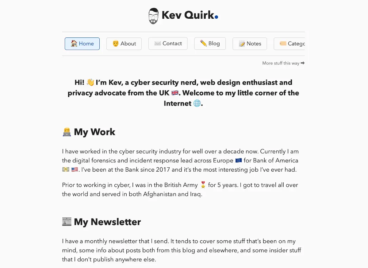
A few weeks ago I wrote about the design history of this site and in that post I reminisced fondly about the really simple design I had on my static Jekyll site. To remind you, here’s what it looked like:

That version of the website was great. I didn’t feel the need to fiddle with the design, purely because it was so simple. I also think that’s the only time in the history of this website where I’ve been truly focussed on only writing content.
So anyway, that got me to thinking about brutalist design. If you’ve never heard of brutalist design, here’s the skinny…
There’s a number of tenets that all brutalist websites should strive to abide by:
- Content is readable on all reasonable screens and devices.
- Only hyperlinks and buttons respond to clicks.
- Hyperlinks are underlined and buttons look like buttons.
- The back button works as expected.
- View content by scrolling.
- Decoration when needed and no unrelated content.
- Performance is a feature.
If you want to know more about what these tenets mean, and what they stand for, check out this site. It’s a great resource for all this brutal shenanigans.
My approach to brutalist design
Regular readers of this site will know that I tend to change things up on the regular. I’ve used Ghost, WordPress, static WordPress, Grav, Jekyll and now I’m back on WordPress.
I keep coming back to WordPress because, in my opinion, it’s the best blogging CMS; so sticking with my trusty WP was a must. Previously I was using GeneratePress as the basis for my theme, but I decided I’d have more control if I designed an entirely new theme instead.
So I downloaded a copy of Underscores I installed my trusty GeneratePress license and set to work creating this site. A couple of weeks of coding this thing up when I had a spare hour here and there, and this is the result. A site that I would consider to be beautiful in its brutalist design.
The brutal tenets
If we go back to those tenets of all things brutal on the web, I think I’ve managed to abide by most, if not all of them. But there’s still work to do.
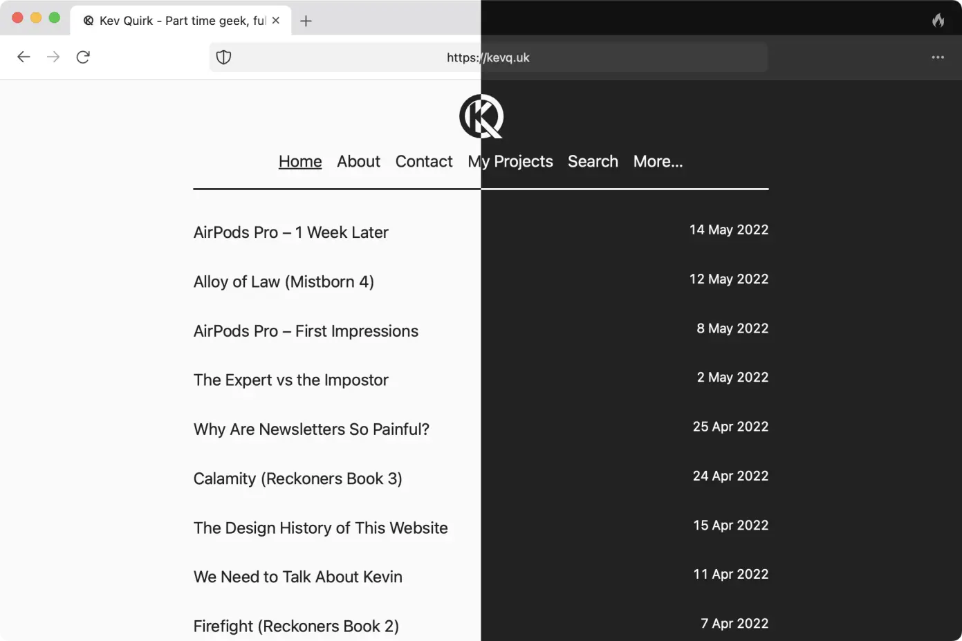
This site now uses a local font stack instead of web fonts, automatic dark mode switching is also back. There’s zero javascript and on the whole I’ve reduced the size of the site down by roughly 100KB. Which means it now measures in at approximately 250KB.
 Light & dark mode in action
But there’s still way more I can do. For example, my projects and blogroll pages don’t really conform to the brutalist mentality. They also make heavy use of GenerateBlocks, which I think is adding a whole load of CSS to the site. So that can go.
There’s also a lot more stuff I can strip out of Underscores to make it even more lean. So my plan for the foreseeable future at least, is to add nothing to the design of this site, only remove.
If I can get below 200KB, I’ll be happy I have now got the site down to ~65KB. But part of me wants to see how skinny I can really make this site. I know Chris Wiegman managed to make a ridiculously small WordPress theme, but he’s forgotten more about WordPress than I’ll ever know. So I don’t think I’ll be able to compete with him.
I could have just downloaded his source code and edited the CSS, but where’s the fun in that? Instead, I’ll slowly start stripping stuff out of this theme, while keeping the front end the same. This way I hope to learn more too.
Wrapping up
I’m really happy with how this new brutalist design has turned out. The site is now extremely content focussed with very little else going on. Which, after all, makes sense as the content is what makes a blog, a blog.
What do you think? Is the new design ok, or have I gone a little too Brad Taunt with the design? Please use the button below to email your thoughts.