Replacing FreshRSS With Miniflux
18 Oct 2020
FreshRSS is a good RSS reader, but I recently decided to switch to Miniflux. This post talks about why I decided to switch.
If you didn’t know already, I love using RSS feeds and I’ve been using FreshRSS to read those feeds for a few years now. It’s self-hosted and generally works well. But I hate the web interface.
It was never really a major problem, as I mostly check my feeds from either my phone or tablet with the Reeder app.
What’s wrong with the FreshRSS UI?
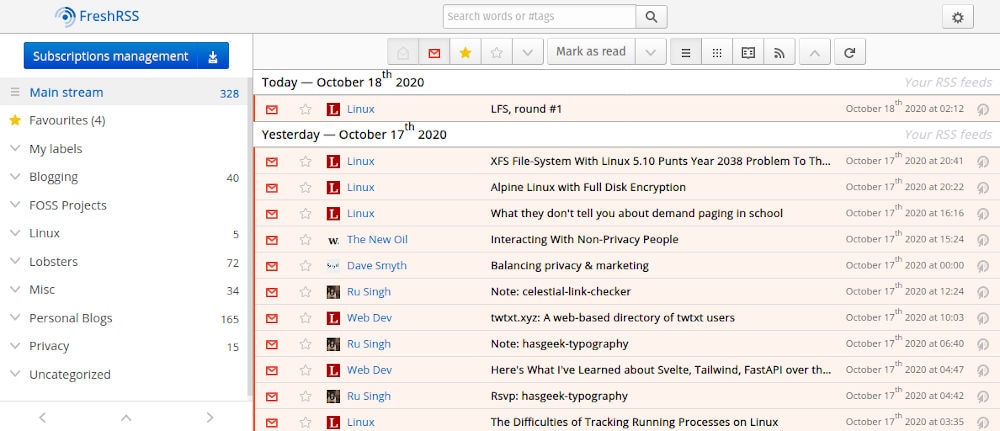
I’m glad you asked, dear reader. Let’s start with a screenshot of the interface, shall we? After all, a picture speaks a thousands words and all that…
 The FreshRSS web interface
Look how cluttered that interface is! There are gradients all over the shop, the colours are awful and it’s difficult to navigate your way around.
For example, if you want to go and visit the origin page (when those really annoying people don’t have the entire post in their RSS feed), you have to click that weird circular icon with the arrow over it on the right hand side.
That would be fine, but the icon is exactly the same as the rest of the metadata, so I have no idea what’s a link and what isn’t.
Second, you see the list of feed items in the image above. Where it says The New Oil, Ru Singh, Linux etc? Logic would dictate that if you click that link, it would open that feed item, right?
WRONG!
If you click that link, you are taken to a list of all items in that feed, not the feed item itself. Again, it’s completely counter-intuitive.
I know I can change the theme, but there are no nice ones bundled with FreshRSS and I don’t have the time (or inclination) to make my own.
Switching from FreshRSS to Miniflux
I had heard really good things about Miniflux. Both Jan-Lukas Else and Ru Singh speak very highly of it.
I decided to pay the $15.00 (~£12.30) a year to have the Miniflux team host it for me. Not only does this save on headaches for me, it supports the Miniflux project too. Win/win. If you prefer to self-host, it’s simple to do.
Why Miniflux over FreshRSS?
When I designed this website, there were 2 things I wanted to achieve from the theme:
- A content-focused experience.
- Beautiful typography.
The whole point of this blog is for you to read my content. Nothing else. Miniflux aligns itself to the same principles:
Miniflux is a minimalist software. The purpose of this application is to read feeds. Nothing else.
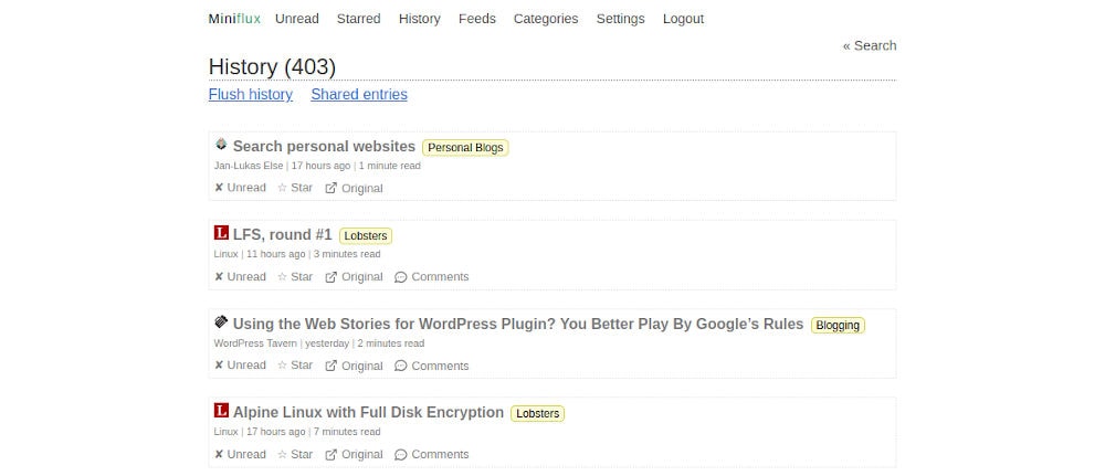
If you take a look at the Miniflux interface, it’s sparse, focused and beautiful. Just the way I like it.

Miniflux isn’t just good looking though. It’s also been thoughtfully built. The user experience is really good. For example, if I want to load the original post, there’s no silly icons that make little sense. I just click on the original link.
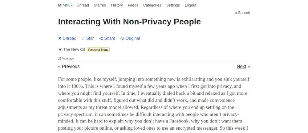
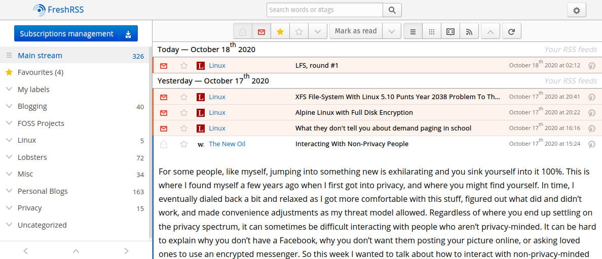
This simplicity continues as you dig into feed items. Everything in Miniflux is simply laid out and content focussed. Take a look at the screenshots below to see what I mean:
 A post on Miniflux
 The same post on FreshRSS
Big difference, right?
Conclusion
I replaced FreshRSS with Miniflux around a month ago now. As a result I have a much better interface that has a beautifully simple reading experience.
Furthermore, I don’t have any headaches because someone else is managing it all for me. And, I get to support a great open source project too.
Finally, I can continue to use the Reeder app on my devices, because Miniflux supports the Fever protocol.
Wins all round, I think.
If you’re thinking about switching feed readers, or if you’re new to using RSS feeds, I’d strongly recommend Miniflux.