What’s In A Font? Website Typography Best Practices
30 Jul 2021
I love web design and website typography is a huge part of that. It turns out that I’m somewhat of a typography nerd, so I wanted to share some of what I’ve learned in this regard here.
What is website typography?
Many people think that typography simply means the font (or font family) you choose for your website. But it’s much more than that. It’s the weight of the text, the width of the lines, the gaps between those lines. Basically it’s every facet of the text on your site.
Choosing the right font for your website is incredibly important, especially if your site has long form written content, like a blog. Those fonts will be seen by every one of your visitors to consume your content.
Type is the clothes your words wear.
I’ve tried to make the typography on this site the best it can be for an amateur like myself, but there’s definitely more I can do. Anyway, let’s start digging into the nuts and bolts of website typography, shall we?
Visual Hierarchy
Visual hierarchy is all a about arranging the different elements on a page so that readers can easily navigate their way around.
You have a gap between between each line (known as line-height or leading), then a slightly larger gap between each paragraph. When using headings, it’s good to have an slightly larger gap at the top so that the heading breaks the content up into separate sections.
Here’s a diagram that explains what I mean in a more visual way:
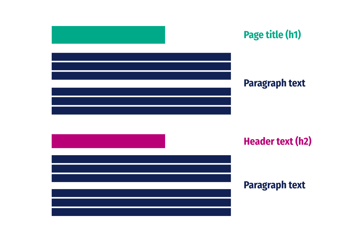
As you can see the title, lines, paragraphs and section header are all distinct. Because of this, the page is naturally broken up into separate parts, which makes things flow better for the reader.
Visual hierarchy also helps with skim reading. Not many people read an entire post word for word; many skim through and pick the parts that are pertinent to them. By carving your posts up in this way you’re making skim reading much easier.
Distinguishing headers
It’s important to distinguish between your body text and header text. You can do this in a number of ways, some sites use a different font family (more on that later); whereas others, like me, use the same font everywhere, but use a different weight for headers.
By making the headers much larger than the body font, and a heavier weight, it’s easy to distinguish between the body text and headers, even though I’m using the same font everywhere.
By the way, if you're interested, I'm using Fira Sans Condensed on this site.
Choosing the right fonts
Choosing the right fonts for your website typography is extremely important. If you get them wrong your content will not only look bad, but your readers will find it difficult to read.
If you get this really wrong, you could actually be damaging your reader’s eyes. So yeah, it’s pretty important.
Serif vs sans serif
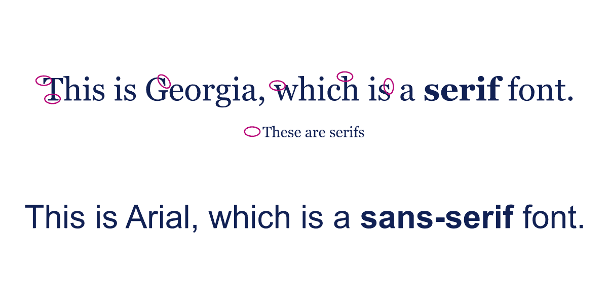
So what is the difference between serif and sans serif when we’re talking about fonts?
Well, serifs are the little embellishments that you see at the end of some letters. The word “sans” is French for “without”. So sans serif literally means fonts without serifs.
So should I use serif or sans serif for my content?
That’s a great question, dear reader. And the answer is use whatever you like. From the research I’ve done, there doesn’t appear to be any hard and fast rules about which style of font is better for websites.
Want to use one of each? Go for it. Want to use all serif? Be my guest. Is all sans serif more your bag? Do it. It’s completely up to you.
Avoid script
I would like to caveat the above statements about using which ever fonts you like with the following:
DO NOT USE SCRIPT FONTS!
Script fonts are for decorative purposes and don’t really work for website typography. There are some exceptions to this, of course, but the general rule of thumb is to avoid script fonts if at all possible.

How many fonts?
The recommendation for the number of fonts you should use is quite simple - use a maximum of 2 fonts. Any more than this can be confusing for the reader and ruin the flow of your content.
I use Fira Sans Condensed across the entire site here, but I have also done a mixture of sans-serif for headers and serif for body text. This also works well.
I would not recommend using two different sans-serif or serif font together though. They can compete with one another and it makes the whole thing look wrong.
If you’re going to fonts, make sure they’re either completely different, or they’re from the same family. For example:
- Fira Sans Condensed & Merriweather.
- Arial and Georgia.
- PT sans and PT serif.
- Merriweather and Merriweather sans.
- Roboto and Roboto slab.
Web fonts
When declaring which fonts you want to use for your website typography, your visitors will need to have that font installed on their system in order for it to display.
Obviously most of my readers won’t have Fira Sans Condensed installed on their system. That’s where web fonts come in.
Web fonts are served from the Internet, either from your own server, or from services like Google Fonts. I prefer to self-host my web fonts, because of the various privacy concerns I have with Google.
When defining your web fonts, it’s extremely important to also define backup fonts. These tell your browser to try different fonts if the main font doesn’t load.
body {
    font-family: "Fira Sans Condensed", helvetica, arial, sans-serif;
}
The code above is from my CSS stylesheet. This tells the browser to try using Fira Sans Condensed. But if that isn’t available for whatever reason, use Helvetica. If Helvetica also isn’t available, use Arial. Most machines have Arial installed on them, but just in case they don’t, I’ve finally told the browser to just load whatever the system sans-serif font is.
This will ensure that my fonts are always sans serif, and serif fonts are never loaded. Something similar can be done for serif fonts too:
body {
    font-family: "Merriweather", Georgia, serif;
}
Font size
It’s really important to ensure that your fonts are large enough to be easily read on a variety of screens. The default size of the paragraph text in most browsers is 16px. I personally find that 16px is a little small for body text.
It’s also important to remember that the rendered font size can vary wildly depending on which font you’re using:
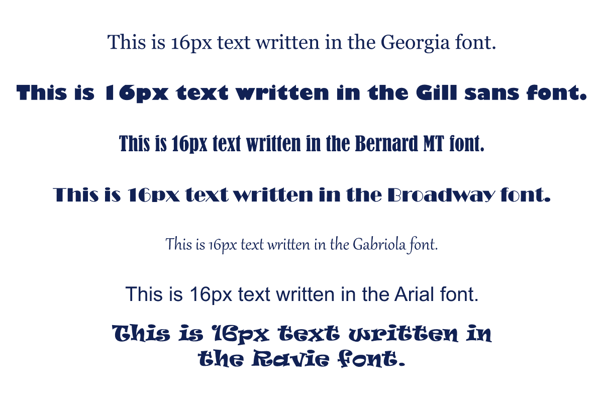
As you can see, the differences can be significant, so it’s worth testing the size of your fonts on your site before you settle. For example, I’ve increased the base size of my paragraph fonts to 20px as I think that works better with Fira Sans Condensed.
Headers
As a general rule of thumb, your main h2 header should be between 180-200% of your paragraph text and your secondary header should be between 130-150%.
So by sticking to those guidelines, my h2 headings are 42px and my h3 are 36px. Both are a little bigger than the guideline, but I felt that these sizes make sense for the font I’m using.
That’s why they’re called guidelines and not rules after all.
Line width
Before researching website typography, I’d never really considered my line width. I’ve always preferred to have wider lines so that there’s less white space either side of the content.
However, this turned out to be all kinds of wrong. The golden zone is around 60 characters per line on a larger screen and 30-40 characters on a mobile device.
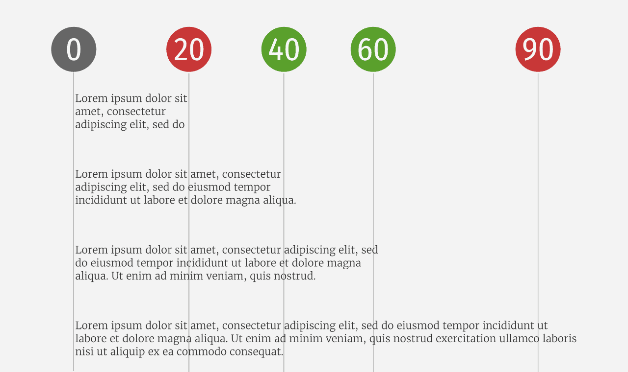
The rationale behind these numbers is that your subconscious mind gets excited when you start a new line. Apparently, at the beginning of a new line your attention is focussed, so by being in this golden zone, it’s easier to keep your reader’s attention.
Having to move your eyes from left to right over over wider spaces can cause eye strain, but having lines that are too narrow can make reading awkward. So it’s important to get this right.
By having a max-width of 600px for the content on this site, I’ve managed to keep the line widths somewhere in the region of where they need to be.
Line height
Line height, or leading as it’s known in typography circles, is the white space between your lines of text. Your line-height should be around 150% of the font size. So my paragraph text is 20px and my line height is 30px.
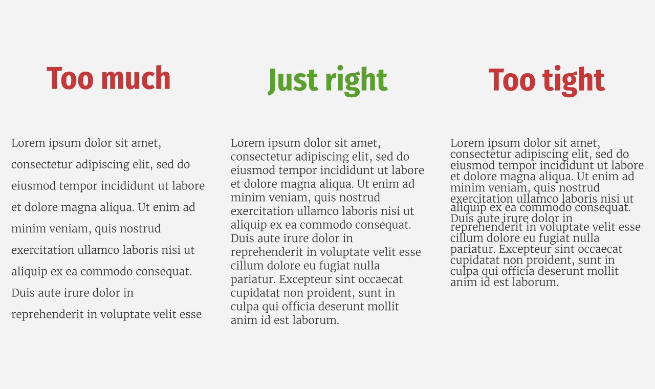
I tend to reduce the line-height on headers though, as having a 150% line-height on large text just looks weird. I tend to keep the line-height for headers to around 120%:
body {
    line-height: 1.5;
}

h1,h2,h3 {
    line-height: 1.2;
}
Colour
I’ve read in a number of places that it’s a bad idea to use pitch black as your font colour for digital displays. Instead it’s recommended to use dark grey, such as #333.
Personally, I use a combination of a very light blue for my background and a very dark blue for the text. It doesn’t really matter what colour you choose for your text, so long as it has enough contrast to be easily accessible.
I personally use this tool to check the contrast when I’m working on text colour.
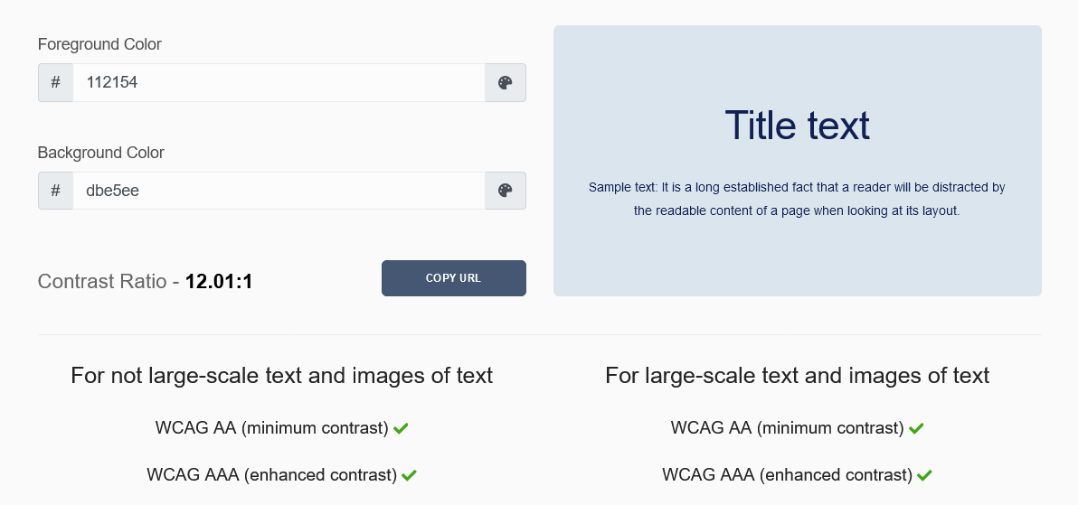
When it comes to using other colours, the advice is to use them sparingly. Aside from 3 different shades of blue, the only other colour I use on this site is my pink accent colour for hyperlinks.
Hyperlinks
By default, hyperlinks are always underlined, but according to practical typography that’s a no no.
Don’t underline. Ever. It’s ugly and it makes text harder to read.
Practical Typography
However, WebAIM standards state that hyperlinks should be underlined and nothing else should be:
Browsers underline hypertext links by default. It is possible to remove the underline using Cascading Style Sheets (CSS), but this is a bad idea most of the time. Users are accustomed to seeing links underlined. In body text, they may or may not be able to figure out which text is linked if the underline convention is not used.
WebAIM standards
On this site, all links are underlined and in my body text they’re also a different colour (pink). They also have a hover effect on them.
If you’re going to use colour within your typography, it’s best to keep it to a minimum. If you are going to use colour for something other than hyperlinks do not use the same colour.
Your hyperlinks should always be unique so that your visitors know that a particular colour always means links. Otherwise things get confusing.
Conclusion
I’ve really enjoyed learning about website typography, and I think as a result of my research the experience on this site should have improved.
I hope you’ve learned something new from this post too. If you have any tips or feedback for me, feel free to leave a comment below.
Further Reading
If you want to do some more reading on typography, here are links to some to sites I’ve found useful while doing this research.