What’s The Difference Between Padding And Margin?
07 Apr 2021
The difference between padding and margin is a bit of a quandary for CSS newcomers. This post explains the difference between them.
If you’re into web design, like me, then you will have likely wanted to increase or decrease the spacing between elements on a page. But should you use padding or margin? Actually, what’s the difference between them?
I’ve had this post in my list of drafts for some time now, because I struggled with this too when I first started out. Someone asked this very question on Fosstodon recently, so I thought it was a good time to finally write this post.
The difference between padding and margin
To best explain the differences between padding and margin, I’m going to use a fake navigation menu. I’m using a nav menu as they tent to need both padding and margin, especially if you want to make the menu items look like buttons.
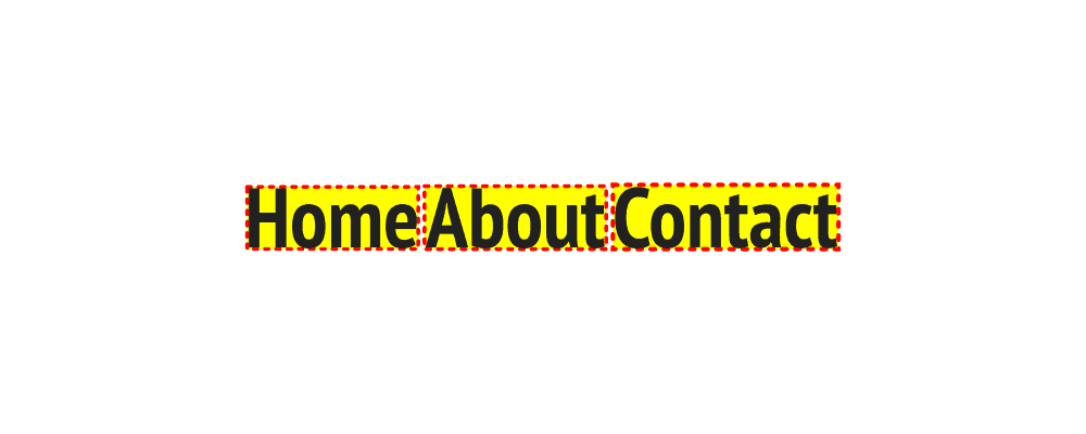
So here’s what the menu looks like by default. Not much of an actual menu, but rather an ugly string of text instead, right? That’s where our padding and margin comes in.

What is padding?
To demonstrate padding, let’s start by adding a red dotted border around each menu item, and a yellow background:

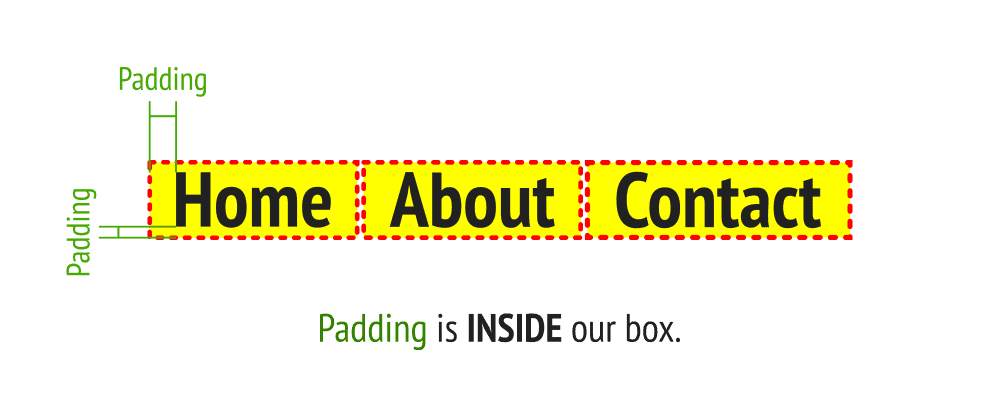
Next we’re going to add some padding to each menu item. If we look at each item, padding would be the space inside the red dotted border. So by adding padding, we’re basically making the inside of the box bigger.
Because padding is applied inside the box and the box has a yellow background, the addition of padding makes the yellow background larger. Here’s what our menu looks like with some padding added:

What is margin?
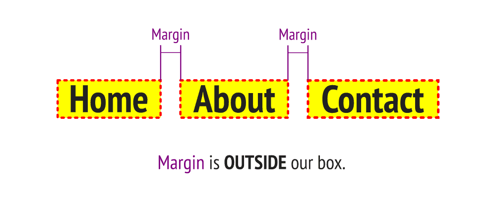
We’ve added padding and our yellow boxes have increase in size, but the space between our boxes is still tiny and it looks weird. That’s where margin comes in.
So if padding is the space inside our box, margin is the space outside of it. Our menu items look a bit like buttons now, so let’s add some margin to increase the spacing between each of the “buttons”:

Now that we’ve added both padding and margins, things look a lot more like a traditional navigation menu. It’s a really ugly menu, but it’s looks like a menu nonetheless.
Where can padding and margins be applied?
Both padding and margin can be added to the top, bottom, left and right of an element and they can be expressed using a number of units of measure. Some people like px, others like em. I personally like rem as it’s a dynamic measurement that is based off of the font in use. Here’s some examples of margin and padding in use:
nav a {
  padding-top: .5rem;
  padding-bottom: .5rem;
  padding-left: 1rem;
  padding-right: 1rem;
}

nav a {
  margin-right: 1rem;
}
Take a look at the padding in CSS above. Four lines of CSS to add padding to all 4 sides of an element is pretty inefficient, right? Lucky for us there’s a short hand way of doing it, like this:
nav a {
  padding: .5rem 1rem;
}
This snippet of shorthand CSS tells your browser to apply .5rem of padding to the top and bottom of the element, as well as 1rem of padding on the left and right. If you want to use a single line, but set different padding on every side, you can do so like this:
nav a {
  padding: 1rem .5rem 0 2rem;
}
The padding declarations start at the top side of the element and work their way around clockwise. So the code above is adding 1rem to the top, .5rem on the right, nothing on the bottom and 2rem on the left. You can use the same methods with margin too.
Putting it into practice
If you want to have a play around with padding and margin on my fake navigation menu, feel free to play around with a CodePen I created. You can edit it here.
Conclusion
Hopefully this post has helped you to not only identify the differences between padding and margin, but also given you some practical tips on how to implement it into your own CSS stylesheets.
If you did find this post useful, please do let me know and I’ll start doing more little snippets like this.